You need a property management website. It’s as simple as that.
Chart of Accounts
Want clearer, cleaner books? What about a more useful view into your properties or just easier accounting in general?
Get the GuideA property management website no longer a simple page that advertises your services. It’s a way to manage your business through owner and resident portals. It’s a place to post listings and a way for prospects to contact you.
It’s also a means to create content that shows off your expertise in your field.
If you’ve never built a website before, don’t worry. There are plenty of services to help you put together a polished, professional site.
But before you jump in, it’s important to understand the elements of a good property management website.
Defining the Mission of Your Property Management Website
Why this is important: A clear objective (or list of objectives) and a deep understanding of your target audience will create a framework for your site.
Before you build anything, there are two questions to ask:
- What are my goals with this website?
- Who is my audience for each of those goals?
Most property management websites tackle similar goals. Those include:
- Creating awareness of the company with prospective clients and residents.
- Providing an easy way for those prospects to get in touch.
- Providing a portal for current owners and residents to conduct contactless transactions, document signing, and other business procedures.
- Providing useful information for current owners and residents.
By creating a list like the one above, you now know the kinds of pages you have to build within your site. Namely, you’ll need a homepage and possibly a blog to build awareness, a contact form, a page for owners and residents to access your portal, and an FAQ or updates page.
Choosing a Host
Why it’s important: Different site hosting services provide different levels of design and different types of analytics, or ways to measure the success of your site. Some are free and some are not. The host you choose will depend on your budget and your comfort level with building a site.
Of course, you can always hire a web designer to build a site for you, but if you’re doing it on your own, you’re going to have to choose a site host.
There are plenty out there, and some are more user-friendly than others. Sites like Squarespace and Weebly are pretty easy to use. They allow you to drag and drop elements and use templates to create your site.
Sites like WordPress and Drupal are much more hands-on, but they offer more for free. WordPress, for instance, gives you a fair amount of analytics for free. And Drupal is an open source solution, so it’s totally free.
They do, however, require more knowledge of coding.
One of the easiest ways to create a branded website is to use your property management platform. Services such as Buildium offer site-building capabilities that are easy to put together. And since their business is property management, they understand the kinds of pages and site structure you’re going to need better than a generic site host.
Site Structure
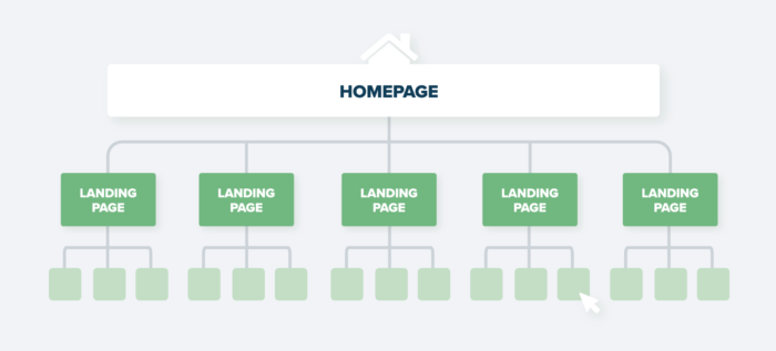
Why it’s important: Knowing how to structure your site is like a company org chart. Direct reports link up to managers, who link up further to directors and VPs. In the same way, lower-level pages are grouped under category pages, which link up to the homepage. By linking pages correctly, you make your site easier to navigate.
First, let’s talk a little bit about putting your website together. Because even if you have a firm grasp on the elements that make a web page, you have to have an understanding of their framework.
To get a better idea, take a look at the diagram below.

In most sites, the homepage is called the parent page. It is the topmost page on the site, the one that all other pages, called the child pages, live underneath. A user accesses all of those pages through the navigation, or nav, bar.
Each category on a nav bar usually leads you to a landing page, or a main page under which more child pages link up to. The homepage is also considered a landing page, by the way.
From the landing page, all other pages that fall under that category. So, your Services landing page would give a brief overview of your company’s offerings, with links to more in-depth pages on each of the services you provide.
Some landing pages, like your contact form, may not have any child pages underneath it.
Landing pages are also important in search results. In fact, they’re called landing pages because they are typically the pages someone lands on when they find you through search.
As you put together your site, think about where each page fits in the site structure.
The Building Blocks of a Solid Property Management Website
Why they’re important: Every website is made up of the same basic pages that users understand and have come to expect. Keywords help people find your site in the first place.
The list in the previous section is just an example. There are other pages you’ll need to build into your site to make it effective. Let’s take a look at the most basic (and most common) pages in an effective property management website.
Homepage
A lot of people will tell you your homepage is like your storefront, that it’s the first page people see when they come to your site.
But that’s only partially true. Yes, a lot of people will come to your site through your homepage, and so it should be attractive and easy to navigate (more on that later). It should also include previews of the information your users will find on other pages throughout the site.
Typically, homepages include:
- The business name and slogan
- Large images of properties you manage
- A brief description of your services, like an elevator pitch
- Two or three of your very best testimonials
- A contact link or even a contact form
- An element of social proof, be it testimonials, reviews, or certifications
That said, it’s important to remember that a user coming through search could land on any of your pages. So, it’s important to put your best foot forward on every part of your site — and include a contact link on as many pages as possible.
Navigation (Nav) Bar
The navigation bar is present on every page of the site, and allows your users to go back and forth through different sections, including back to the homepage. Some nav bars simply link to landing pages, while others include dropdown menus that allow users to click through to child pages without having to stop at a landing page first.
Services
There are two ways to organize your services page. You can either create one landing page that explains all your services, or your landing page can serve as a jumping-off point for other individual pages that explain each one in more detail.
It all depends on your users. If they prefer to get to information in fewer clicks, the first option will serve you well. However, if you have distinct audiences that are searching for information on particular services through Google or Bing, a more detailed page that users can land on from search engines might be the way to go.
No matter what you choose, each of your services page should have a contact link toward the top of the page.
Listings
Your listings page will be your most visited page. Here you’ll keep all of your current listings, along with images or virtual tours, and contact information.
Pro tip: Property management software like Buildium allows you to post branded listings to your website, as well as to other platforms across the internet.
Portal Landing Page
This should be a fairly straightforward page that simply allows current residents and owners to access their accounts. Through here, they can pay rent and fees, access discussion boards and announcements, and upload and view documents.
About
The About section is your opportunity to humanize your business. It’s here you get to tell your business’s story and talk about your values. Often, you’ll find a business’s mission statement here.
Don’t forget to include images and brief bios of your team members, as well. Prospects are more likely to respond if they can put a face to a name.
This is also the place to include important press releases and company announcements, and to showcase any volunteer or charity work your company performs.
Blog
If you are a small property management firm with a brand new blog, it’s going to be pretty hard to use your blog to rank in search results, which is one of the major reasons companies create blogs.
That doesn’t mean, however, that you shouldn’t start one. Writing a blog about property management, real estate investment, or other related topic still sets you up as a subject matter expert and bolsters your reputation as a knowledgeable, trustworthy company.
Share your blog posts on your social accounts. Create links to new posts in owner or resident newsletters.
Over time, you may find your content catching on as followers like and share your posts. And eventually, you may even start showing up in search results for local, region-specific topics, driving traffic to your site.
Contact
We’ve mentioned the contact page more than once already. This is probably the most important page on your site if you’re looking to expand your clientele or your resident pool.
Create a contact form and put it all over your site (or at least link to it everywhere). The easier you make it for people to contact you, the more leads you’ll get.
Keywords
Keywords are the terms people search for when they use Google, Bing, or another search engine. Terms that people might search for when looking for a business like yours might include property management services, or apartments/houses to rent.
If those keywords appear on your site, the search engines will include you in their search results.
Of course, there are other keywords that might be relevant to your business, depending on your area, the services you provide, and the properties you manage. The trick is to do some keyword research using either a research tool or by simply entering search terms like property management services into Google and looking at the alternate terms at the bottom of the page.
Once you have a good list of popular keywords, look for places to include them on your site. For example, property management services would most likely appear on your homepage, as well as your services page.
More specific keywords could become blog post topics.
While there’s no magic bullet to get you to the top of search results pages, keywords used in strategic places on your site will help the search engines find you in the first place.
Pro tip: Avoid keyword stuffing, or using a keyword all over the place to influence your ranking in search. The search engines are on to that practice and won’t rank you, particularly if the keyword sounds unnatural in the text, or has nothing to do with the focus of the page.
Links
Links appear everywhere on your site. Nav bar text links to corresponding pages, for example. But links can appear in your text, as well.
Use in-text links in blog posts to link to related service pages. Listings will link out to contact and application pages.
Use links to help your users navigate your site and find the information they need.
The User Experience
Why it’s important: You have about 15 seconds to make a good impression on anyone who comes to your site. That’s how long it takes a user to decide whether or not a website is worth their time. (No pressure or anything).
A good user experience (clean design, easy navigation, good imagery) will help people who come to your site decide to stick around.
Images
Remember those 15 seconds you have to keep people on your site? We mentioned briefly that good images are one of the keys.
Well-placed, high-quality images make a good impression on your users—and help your site rank. For most property management websites, that includes images of the properties they manage, pictures of the cities or towns they serve, and portraits of key team members.
There are different kinds of images you can place on your site:
- Hero banners: These are large, sweeping images you see on web pages, often at the top. Use them on homepages and landing pages to showcase your properties or your city.
- Feature images: These are larger images that appear at the top of blog posts. They’re not as large as hero images, which tend to extend to the edges of (or bleed off) the page.
- Icons: These are small symbols often used in place of bullets or text links. A “Contact Us” button on your site is an example of an icon.
- Thumbnails: These are smaller images, often used in place of icons.
Large images for hero banners should be at least 1500 pixels wide, while feature and other images should be about 700 pixels.
There are all kinds of images out there and all kinds of directions you could take your design. But, when choosing the right imagery, it’s important to go back to those first two questions: what are my goals and who is my audience for those goals?
Answering those questions should help you choose the right kinds of high-quality images for your site.
Pro tip: Once you’ve placed your images on your site, test it on mobile. Images should resize to fit mobile screens. They shouldn’t get cut off, distorted, or appear pixelated.
Text Placement
There’s an old newspaper term that has carried over to web design: above the fold. For newspapers, it refers to stories and images that appear at the top of the page, before the crease where the newspaper is folded in half. It’s where the most important stories appeared on the front page, because that’s the part of the paper people saw first.
For web, it refers to all of the information that appears before you have to scroll.
Do you see where we’re going with this?
A 2018 Neilsen study found that, although users do scroll more than they have in the past, 57 percent still hang around above the fold, and 74 percent spent most of their on-screen time within the first two scrolls.
So, your important information should appear, as much as possible, toward the top of your homepage and landing pages.
Text vs. Whitespace
Whitespace refers to any space on your site without text. It could be a solid color, or it could be a background image.
Allowing for whitespace helps focus your reader’s attention on your words, or on important design elements, such as buttons you want them to click.
So, while it may be tempting to cram all of your text above that fold, resist that temptation and allow for some breathing room around your text blocks.
CTA Buttons
A CTA is a call to action, something you want your users to do. Button icons are a great way to draw attention to CTAs. You can use them for (you guessed it) contact forms, application submissions, or other actions you want your users to take.
CTAs should be specific. Instead of “click here” or “contact” use phrases like “ask us a question,” “talk to us,” or “apply here.”
A website is no longer a nice-to-have for property managers. It’s an essential tool not only for your marketing, but also for running your day-to-day business. Your site is the gateway for your clients and residents to make payments, sign documents, and get reports.
Your site is your hub for listings and a means for people to get in touch with you.
In this article, we’ve described the basics of web building. They’ll give you a sharp-looking, professional website that will help you run your business. Once you master these, you can improve and optimize your site to expand your reach and grow your business.
Read more on Growth

